Top 5 Serif Fonts for your next modern UI / Graphics project
One of the most important skills you can learn as a designer is how to choose the type. This is because the text is one of the primary ways designers can communicate with users.
Typography can make or break a design.
In today’s digital world more than ever people are aware of typography, design and how the world looks around them.
Today we share the 5 most popular Serif Fonts for your next UI / Graphics project:
1. Bodoni

Bodoni is a serif typeface originally designed by Giambattista Bodoni in 1798. The earlier versions of Bodoni were considered Transitional while the later versions fall into the Modern category. The typeface is known for its extreme contrast between thick and thin strokes which can make it more suitable for a display face rather than a text face.
Designer: Giambattista Bodoni
Category: Serif
Types: 7 Typefaces / 2 Value Packs
Download / Source: 1001freefonts.com
2. Domaine Display
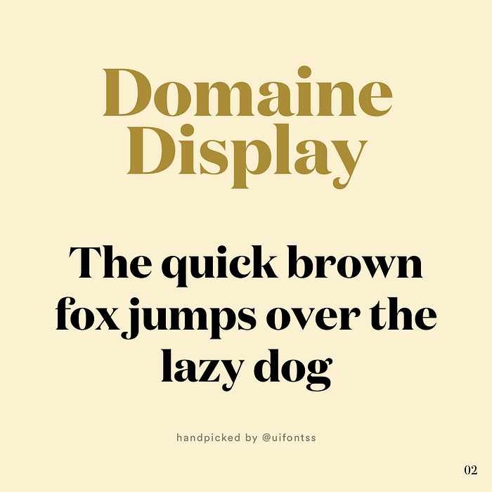
Domaine Display is the display version of the Domaine family designed by New Zealand-based designer Kris Sowersby in 2013. The typeface has its origins in the logotype Sowersby designed for the Australian wine company, Hardys. The display version of Domaine is more flamboyant than the text version, with higher contrast and more prominent hook terminals. Domaine Display also contains some unique alternate characters in the italic uppercase, such as the E and the F.
Designer: Kris Sowersby
Category: Serif
Types: 6 Typefaces
Download / Source: www.cufonfonts.com
3.Garamond
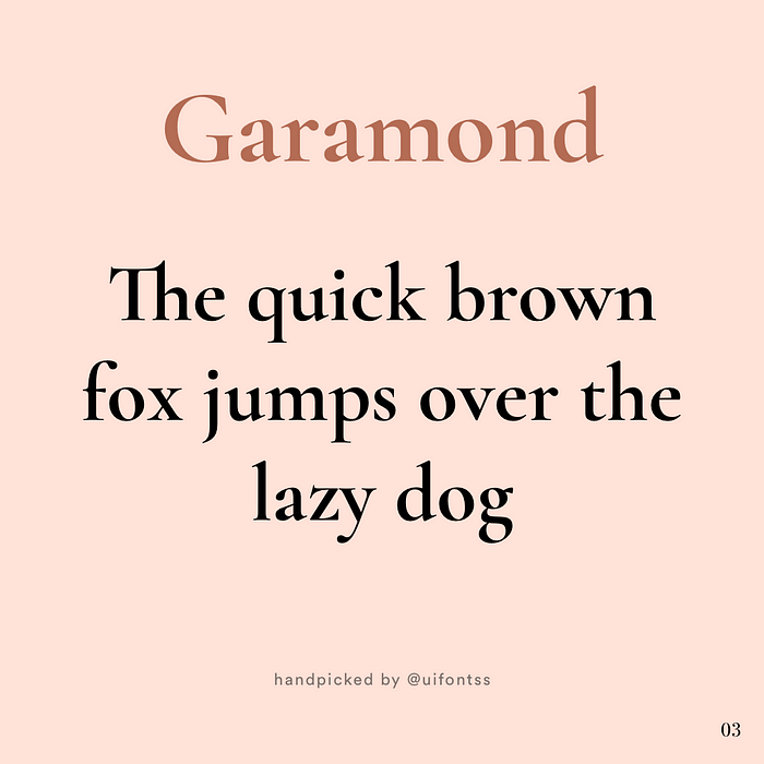
Garamond was designed by Robert Slimbach and released in 1989. However, the Garamond typeface has a long history spanning many centuries. The original versions were based off the designs of Claude Garamond dating back to the sixteenth century. Garamond is commonly used for setting type in printed books but has also started to become a popular font used on the web.
Designer: Robert Slimbach
Category: Serif
Types: 6 Typefaces
Download / Source: www.wfonts.com
4.Century 725
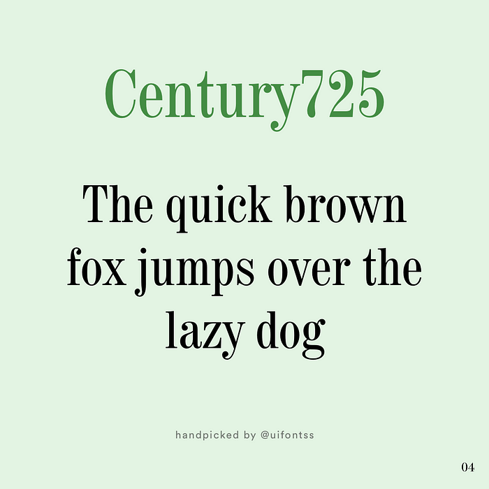
Century 725 designed by Heinrikch Wilhelm Hoffmeister. Century 725 is a stunning choice and very elegant. Lots of designers enjoy using it in projects that call for something that is bold while still maintaining a refined and smart aesthetic. Century 725 is best used in headings / Sub-Headings.
Overall, Century is a stylish and tasteful typeface and you can rarely go wrong in using it.
Designer: Heinrikch Wilhelm Hoffmeister
Category: Serif
Types: 6 Typefaces
Download / Source: www.myfonts.com
5. Playfair Display
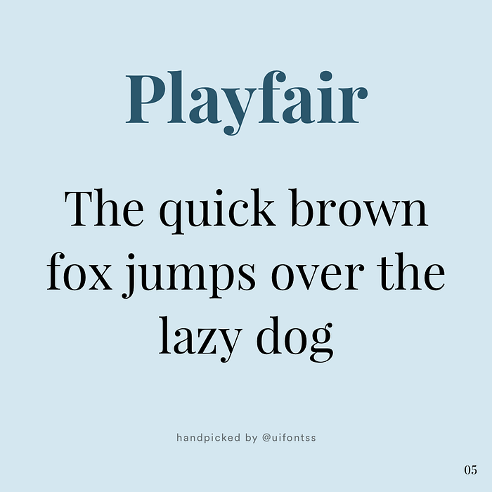
Playfair Display is a serif font with beautiful curves and well-rounded corners, which is suitable for both traditional, as well as modern websites. The design is influenced by typefaces from the mid to late eighteenth century, such as Baskerville. It makes an excellent font for titles and headlines (especially the beautiful italic).
Designer: Claus Eggers Sørensen
Category: Serif
Types: 12 Typefaces
Download / Source: fonts.google.com
Thank you
Which one is your favorite? Do share your favorite fonts or share your work/project where you used these fonts!
Follow for more daily inspiration : Instagram


